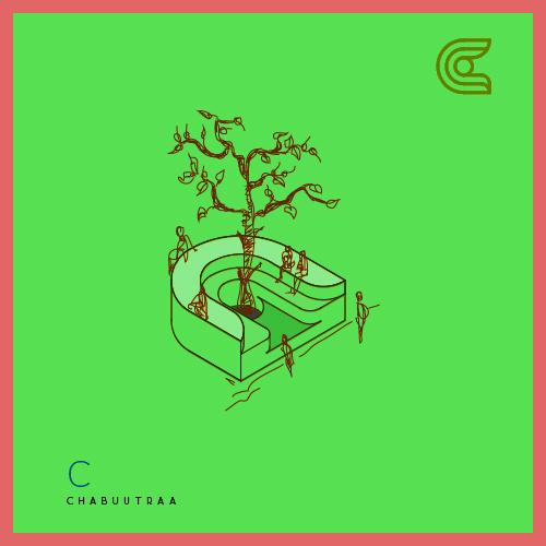
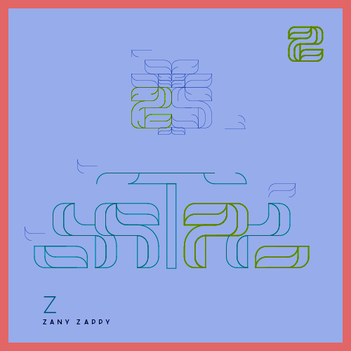
Grid . Line . Circle . Arc .
inh sab se baney hai ye aksharon k forms.
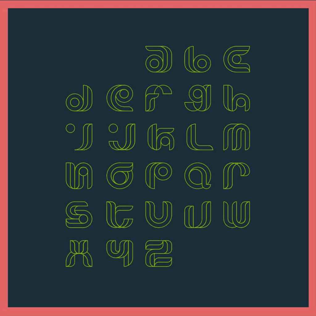
Shaping Alphabets : This has been a exercise in making use of geometry in order to generate shapes of small-case alphabets that fit a similar style-type.
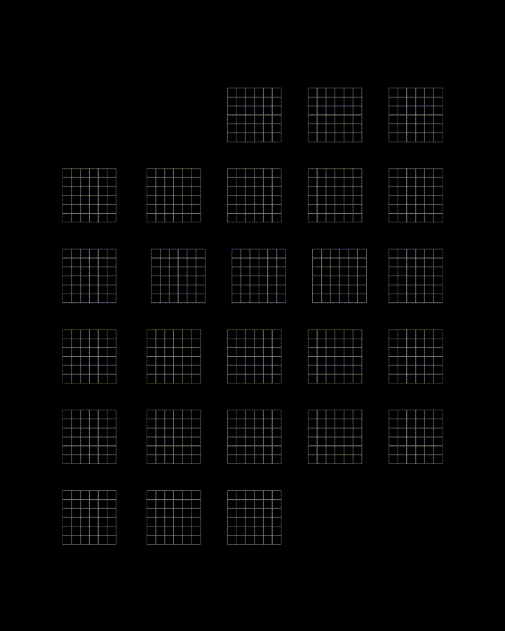
Constraints & Consistency : These alphabets, have been shaped from a 6 X 6 square grid. This constraint not only challenged me to think creatively within a limited space and chekard format, but also to ensure uniformity and consistency in style.

Through the usage of the two simple geometric forms, straight lines (both hotizontal and vertical) and the circle (fully or partially), these forms have been created. By utilizing these two through the principles of geometry, each letter can be crafted to maintain the same visual weight and balance, resulting in a cohesive typeface.
Formwork : The tickhness of each path in this format was not less than the dimension of a single square.
The letters tapered to the extremes with as the lines converted to a curve, at most places using quarter of a circle. Using the full circle at spaces has also given the letters a sense of focus in unique ways and an overall uniformity.
VerveType6X6
Keywords: Geometric, Fluent, Dimensional, Abstract, RetroBold, ArtsyFuture, Curvilinear, FlowType, Pathform, Shapebuild, Lively
Stylistic Features:
- rounded, double-line curves for a distinct appearance and dept.
- simplicity accentuating the unique shape of each letter, akin to abstract art.
- letterforms exude movement and energy, embodying a modern, dynamic typographic style.
- harmoniously blend of retro vibes and contemporary aesthetic.
- sans-serif font characterized by overlapping curves, adding to its uniqueness.
Creation of VerveType6X6 Alphabet Forms:
The creation of these alphabets was a journey with geometry. It began with a vision to have each stroke and each curve shaped with the intent to add depth and dimension.
The lines were drawn with a gentle precision, curving into each other like waves and leaves and wings, that overlap and recede, giving rise to a double-line effect that is both subtle and impactful.
The design process was iterative, a constant balancing act between simplicity and expressiveness, ensuring that each letter stands out as a piece of abstract art.
The outcome is a font that moves beyond the traditional confines of typography. It is a sans-serif one that captures both the expressiveness of the retro and the boldness of the future.
More importantly, the attempt was to create a communicative set of alphabet that has vibrancy and liveliness. Every rounded edge and interlocking curve, contains an impression of some natural form, carrying a sense of borrowing from each other and fluidity in formwork that takes birth within its own geometry.
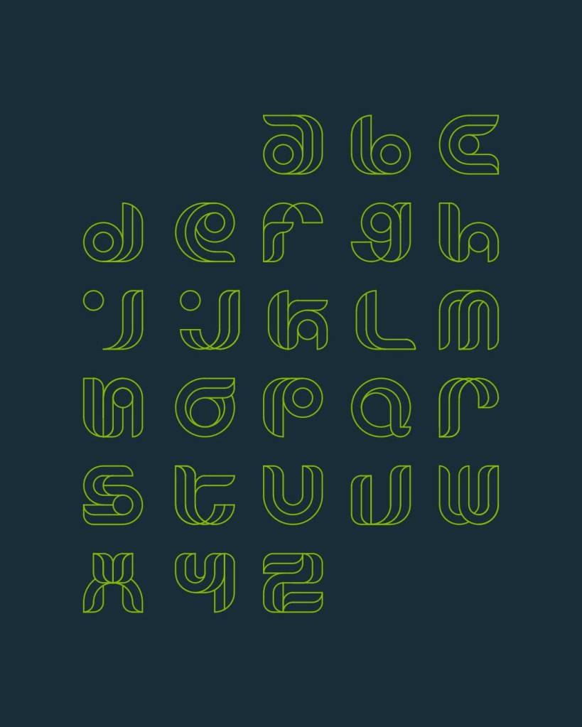
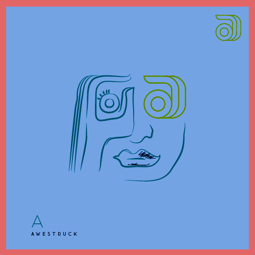
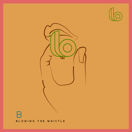
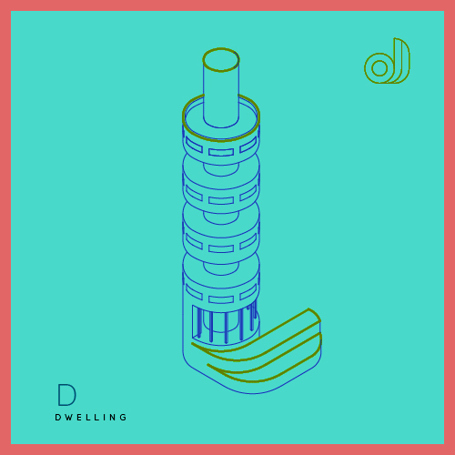
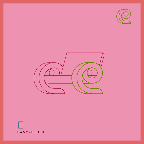
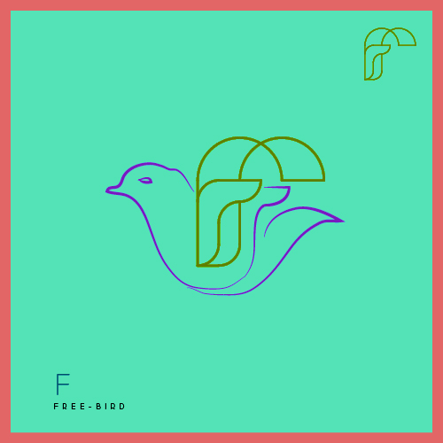
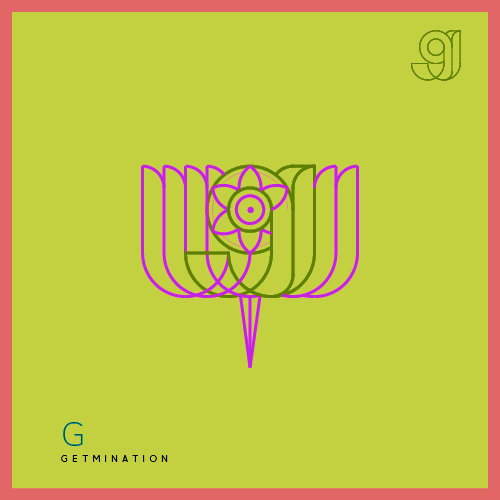
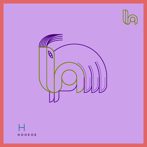
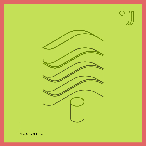
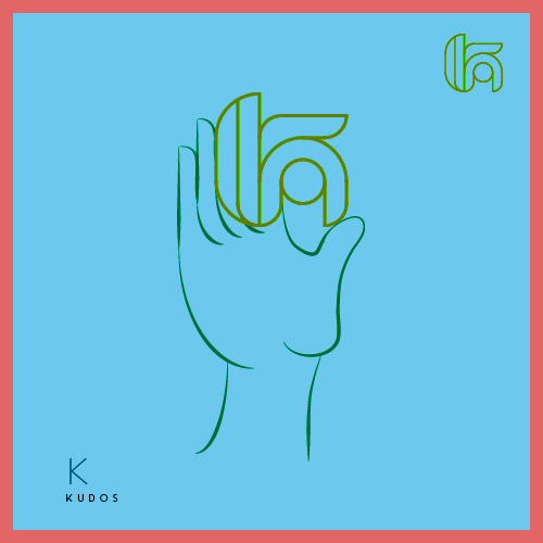
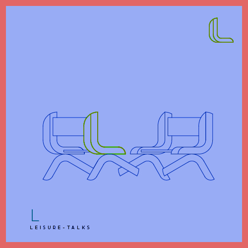
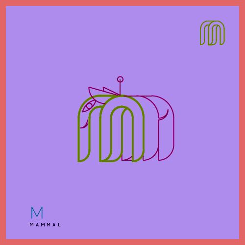
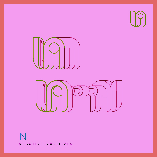
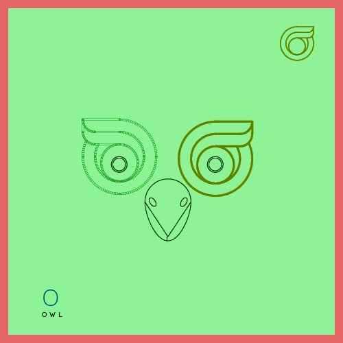
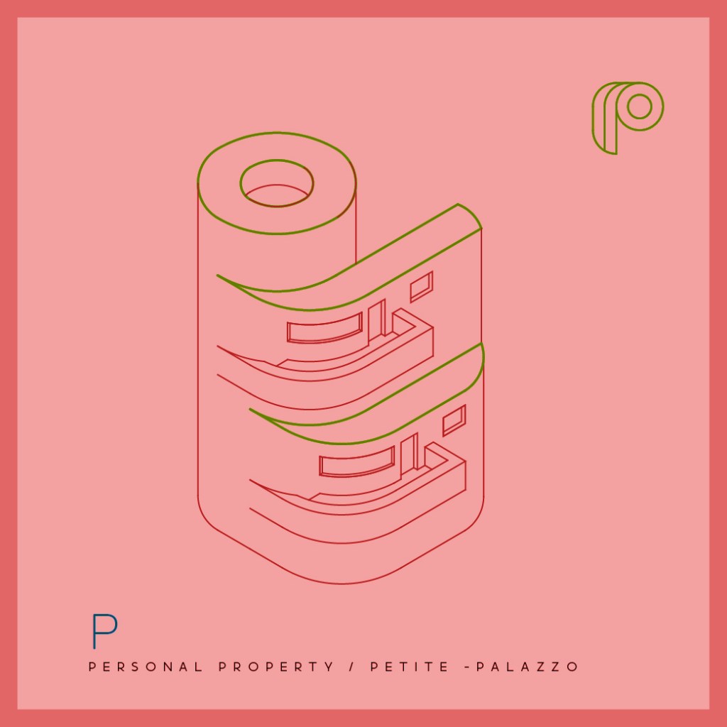
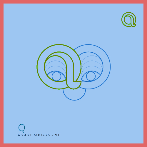
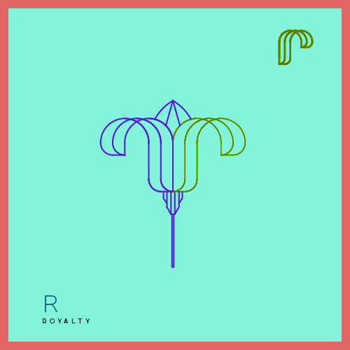
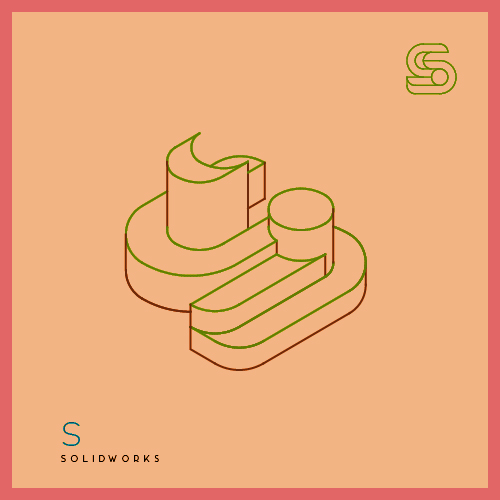
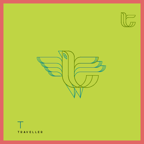
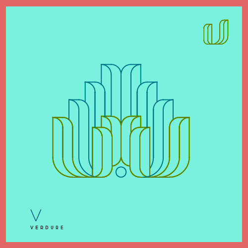
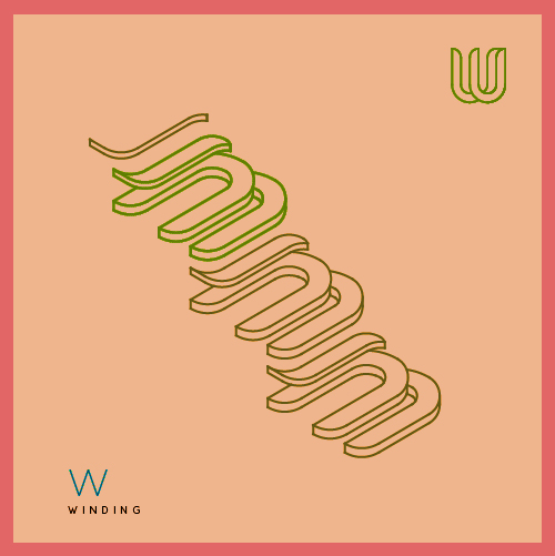
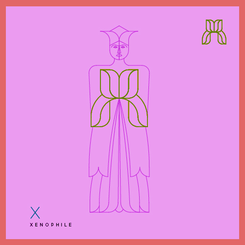
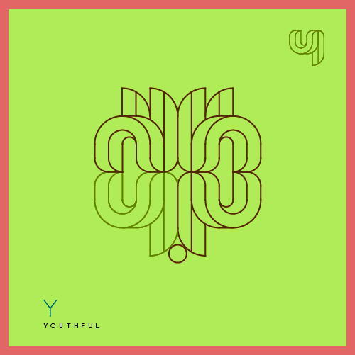
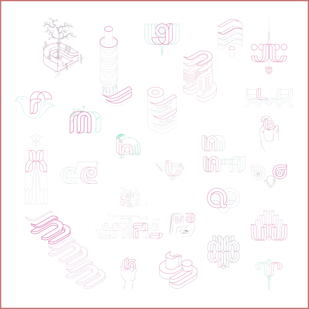
VerveType6X6 :: Abstractica
“ABSTRACTICA” :: A celebration of abstract creativity within each letter.
This exercise aims to construct a visual dictionary spanning a to z from VerveType6X6, where each character is infused with elements from everyday life, visuals, scenes, and imagined forms. Here, the alphabet transcends its symbolic function to become narrators, each letter weaving its own unique tale.


VerveType6X6 aur Abstractica samaapt
& I am hoping you enjoyed what you saw 🙂